Mobile Website Builder Selector
Answer a few questions to find the best free tool for building your website from your smartphone.
Why this fits you:
Key Free Tier Limitations:
You’re sitting in a cafe in Indiranagar, laptop dead, and you just had the perfect idea for a portfolio site or a small business landing page. You pull out your phone. Can you actually build a professional-looking website right there, without paying a rupee for software or hosting?
The short answer is yes, but with caveats. Building a site on a smartphone isn’t like dragging and dropping blocks on a desktop monitor. The screen is smaller, the keyboard is slower, and some features are hidden behind menus. But thanks to modern cloud-based platforms, it’s entirely possible to go from zero to live URL using only your Android or iPhone. Here’s how to do it, what tools work best, and where you’ll hit walls.
Key Takeaways
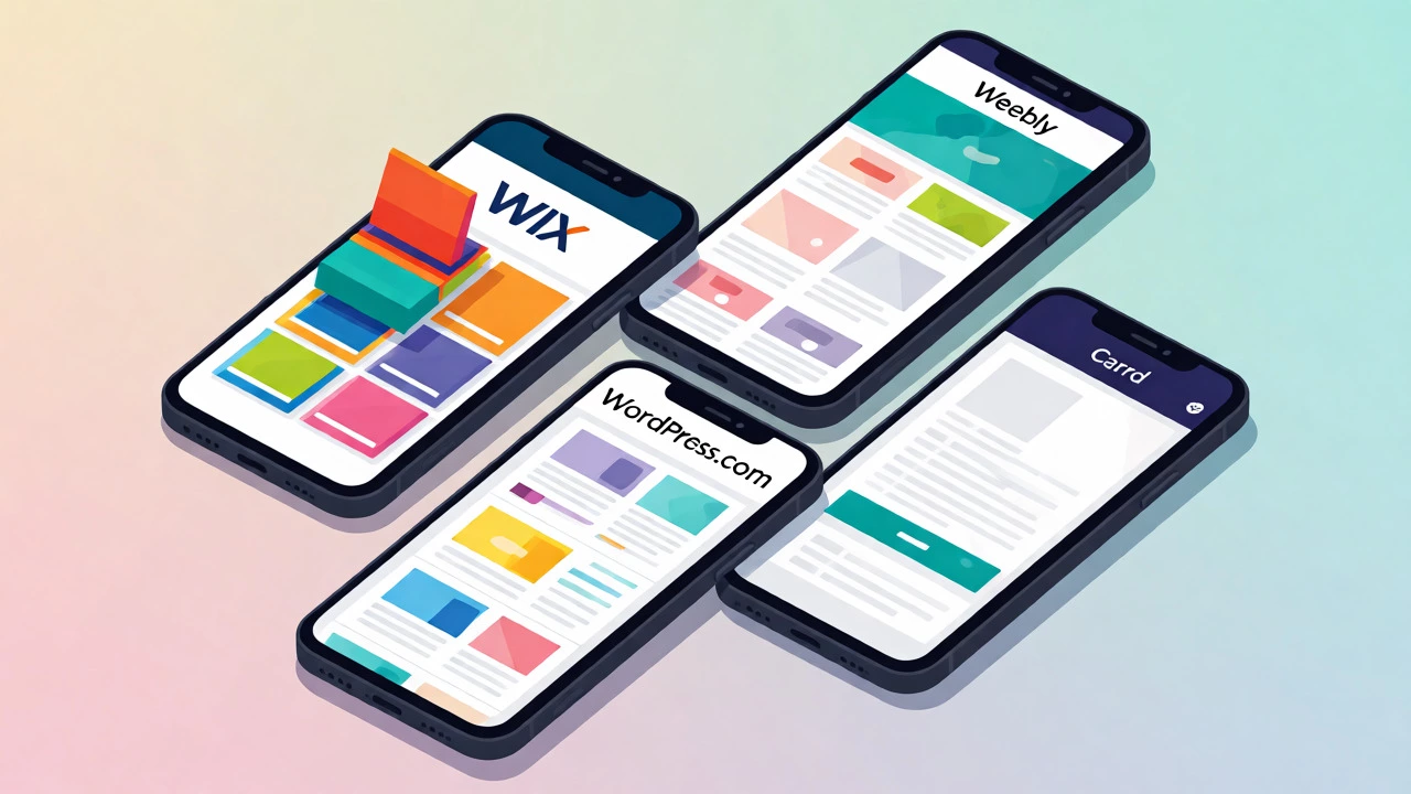
- Yes, it’s possible: Platforms like Wix, Weebly, and WordPress.com offer mobile-optimized editors that let you build sites directly from a browser or app.
- Free tiers exist but have limits: Expect subdomains (e.g., yourname.wixsite.com), platform ads, and limited storage/bandwidth on free plans.
- Design complexity suffers: Complex layouts, custom CSS, and advanced plugins are harder to manage on a touch interface compared to a desktop.
- Content creation is easier than coding: Writing text, uploading images, and arranging sections works well on mobile; writing HTML/CSS code does not.
- Preview is non-negotiable: Always test your site on different devices before sharing, as mobile editors sometimes render differently than final output.
Why Build a Website on Your Phone?
Most people assume you need a computer to start a website. That was true ten years ago when you needed FTP clients and local development environments. Today, the barrier to entry has dropped significantly. If you’re a student, a freelancer, or someone testing a quick business idea, waiting until you get home to open a laptop might mean losing momentum.
Building on mobile is ideal for three specific scenarios:
- Rapid Prototyping: You want to validate an idea quickly. A simple one-page site built in 30 minutes on your phone can gather email signups or feedback immediately.
- On-the-Go Updates: You run a small shop or service business. Need to change your opening hours or post a photo of today’s special? Doing it from your phone takes seconds.
- No Hardware Access: Maybe you don’t own a laptop yet, or yours is broken. For basic informational sites, a smartphone is sufficient hardware.
However, if you plan to build a complex e-commerce store with hundreds of products or a blog with intricate categorization, starting on mobile might frustrate you. It’s better suited for simpler structures.
Top Free Tools for Mobile Website Creation
Not all website builders play nice with small screens. Some require heavy JavaScript processing that drains battery and lags on older phones. Others rely on drag-and-drop interfaces that become unusable when fingers cover half the preview window. Here are the ones that actually work well on mobile browsers or dedicated apps.
| Platform | Mobile App Available? | Free Plan Limits | Best For |
|---|---|---|---|
| Wix | Yes (Wix Owner) | Subdomain, Wix Ads, 500MB Storage | Visual learners who want templates |
| Weebly | Yes (Weebly Site Builder) | Subdomain, Square Ads, 500MB Storage | Simplicity and ease of use |
| WordPress.com | Yes (WordPress App) | Subdomain, WordPress Ads, Limited Plugins | Blogging and content-heavy sites |
| Carrd | No (Browser Only) | 1 Site, Subdomain, Basic Features | Single-page portfolios or link hubs |
Wix: The Visual Powerhouse
Wix is a cloud-based web development platform that allows users to create HTML5 websites and mobile sites through the use of online drag-and-drop tools. On mobile, their "Wix Owner" app lets you edit existing sites, but creating a new one usually happens via the mobile browser. The editor is responsive, meaning elements stack vertically, which is exactly what you want for a phone screen. You pick a template, swap out text, and upload photos from your gallery. The learning curve is gentle, but be aware: the free plan displays prominent Wix banners at the top of your site.
Weebly: Simple and Structured
Weebly focuses on structure over freedom. Instead of placing elements anywhere on a canvas, you add them into predefined sections. This makes it surprisingly easy to use on a touchscreen because you don’t have to worry about precise pixel placement. The mobile app allows you to publish changes instantly. It’s less flexible than Wix, but if you just need a clean brochure-style site, it’s faster.
WordPress.com: Best for Writers
Don’t confuse this with self-hosted WordPress.org. WordPress.com is a hosted service that manages the server for you. The mobile app is excellent for publishing posts, uploading media, and managing comments. However, deep design customization (like changing fonts globally) is often locked behind paid tiers or requires desktop access. Use it if your primary goal is blogging.
Carrd: Minimalist Single-Pagers
If you need a digital business card or a landing page for a social media profile, Carrd is unbeatable. It runs entirely in the browser, so no app download is needed. The interface is stripped down-just text, images, and buttons. Because there’s no complex layout engine, it loads fast even on slow 4G connections. The free tier allows one site, which is plenty for most personal projects.
Step-by-Step: Building a Site on Android/iPhone
Let’s walk through the actual process using a generic block-based builder like Wix or Weebly, as the logic applies to most.
1. Choose Your Template Wisely
When selecting a template on mobile, look for labels like "Mobile Optimized" or "Responsive." Avoid templates with complex background videos or horizontal scrolling galleries. These consume data and render poorly on small screens. Pick a vertical layout where content flows naturally from top to bottom.
2. Edit Text Before Images
Touch keyboards are small. Typing long paragraphs is tedious. Start by replacing placeholder headlines and short descriptions. Keep sentences concise. Save your draft frequently-mobile browsers can crash if memory gets low, especially on older devices.
3. Upload Media Directly from Gallery
One advantage of mobile building is instant access to your camera roll. Select high-resolution images but check their file size. Large JPEGs will slow down your site load time. Most builders compress automatically, but it’s good practice to crop images to square or portrait ratios, which display better on phones.
4. Arrange Sections Vertically
Desktop designs often use sidebars or multi-column grids. On mobile, these collapse into single columns. Ensure your navigation menu is set to "Hamburger" style (the three-line icon). Test the menu button to make sure links are large enough to tap accurately. Fingers are thicker than mouse cursors; tiny links lead to user frustration.
5. Preview and Publish
Before hitting publish, use the preview mode. Scroll through the entire page. Check for overlapping text or cut-off images. Once published, share the link with a friend who uses a different device (e.g., send it to an Android user if you have an iPhone) to verify cross-device compatibility.
The Hidden Costs of "Free"
Nothing on the internet is truly free. When you choose a free hosting plan, you’re trading money for other constraints. Understanding these trade-offs prevents disappointment later.
- Branded Subdomains: Your URL won’t be
yourbusiness.com. It will beyourbusiness.weebly.com. This looks less professional to potential clients. Buying a domain costs around ₹800-₹1,200 per year in India, but it’s optional for hobby projects. - Platform Ads: Providers place banner ads on your site to subsidize your hosting. You cannot remove these on free plans. If you’re trying to sell something, competitor ads on your page can distract visitors.
- Limited Storage: Free tiers typically offer 500MB to 1GB. High-quality photos eat this up quickly. You’ll need to optimize images aggressively.
- SSL Certificates: Good news: most reputable builders now provide free SSL (HTTPS) on free plans. This ensures secure connections, which matters for SEO and trust.

Tips for Smoother Mobile Editing
If you’re serious about maintaining your site from your phone, adopt these habits:
- Use Cloud Storage: Store your logo and brand assets in Google Drive or Dropbox. This way, you can access them from any device, not just the phone you used to create the site.
- Install a Keyboard Extension: Standard phone keyboards lack shortcut keys for formatting. Apps like Gboard allow custom shortcuts. Set ";em" to expand to your email address or ";sig" to insert your bio snippet.
- Batch Your Edits: Don’t try to redesign the whole site in one sitting. Mobile editing causes fatigue. Do 15-minute sessions: update one section, save, exit.
- Clear Cache Regularly: If edits aren’t showing up after publishing, clear your browser cache. Mobile browsers often hold onto old versions of pages to save data.
When to Switch to Desktop
There comes a point where mobile building becomes inefficient. Consider moving to a computer if:
- You need to install third-party plugins or apps that aren’t available in the mobile interface.
- You’re adding more than 10 pages and need to manage internal linking carefully.
- You want to write custom CSS or HTML for unique styling effects.
- You’re setting up complex e-commerce features like shipping zones or tax calculations.
Remember, the goal is to launch, not to perfect. Get your site live on mobile, then refine it on a larger screen if necessary.
Can I buy a custom domain while keeping my site free?
Yes, but you still pay for the domain registration. Most free builders allow you to connect a purchased domain, though some lock this feature behind a paid upgrade. Check the specific terms of the builder you choose.
Is a mobile-built website bad for SEO?
No, search engines don't care how you built the site. They care about speed, mobile responsiveness, and content quality. As long as your site loads quickly and works well on mobile, it will rank fine. In fact, since Google uses mobile-first indexing, having a mobile-friendly site is crucial.
Can I move my free site to another host later?
It depends. Platforms like Wix and Squarespace make it hard to export raw HTML/CSS. You might lose your exact design. WordPress.com offers export tools that preserve content but may break theme-specific layouts. Always check the export options before investing too much time.
Do I need an app, or can I use the browser?
Both work. Browsers give you access to the full desktop-like editor interface, which is often more powerful. Apps are optimized for quick edits and notifications but may hide advanced settings. Try both to see which feels more intuitive for your workflow.
How much data does building a site use?
Surprisingly little for text editing, but image uploads can be heavy. Uploading 10 high-res photos could use 20-50MB. Stick to Wi-Fi when uploading media to avoid draining your mobile data plan.