
Responsive Design Simulator
Simulate Viewport Width
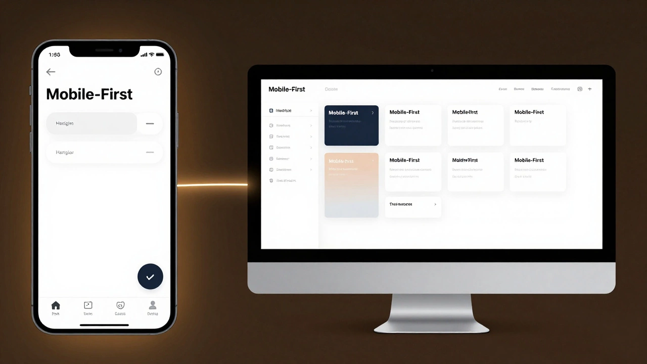
Drag the slider to see how a fluid grid layout adapts from desktop to mobile, demonstrating the core principle of responsiveness.
Why This Matters in 2026
This simulator demonstrates the shift from fixed widths to fluidity. Notice how elements stack vertically on smaller screens? This is handled by CSS Media Queries, ensuring that content remains readable and accessible without horizontal scrolling. Adopting a Mobile-First approach ensures your base CSS is clean and performance is optimized for users with limited data plans.
Back in 2010, making a website work on an iPhone was a special skill. Today, if your site doesn’t look perfect on a phone, a tablet, and a 4K monitor simultaneously, you aren’t just losing visitors-you’re losing trust. So, is it difficult to make a website responsive? The short answer is no. In fact, with modern tools, it’s easier than ever. The longer answer is that while the *coding* isn’t hard, the *design thinking* requires a shift in mindset.
Many developers still treat responsiveness as an afterthought-a quick fix applied at the end of a project. This approach leads to broken layouts, squashed images, and frustrating user experiences. If you want to build sites that actually perform well in 2026, you need to understand why responsive web design (RWD) works and how to implement it without fighting your own code.
The Core Principle: It’s About Fluidity, Not Fixed Sizes
To understand why responsive design isn’t difficult, you first have to stop thinking in pixels. For years, designers built websites based on fixed widths-usually 960px or 1200px. If a screen was smaller, the content got cut off. If it was larger, there was empty white space. Responsive design flips this script by using relative units like percentages, vw (viewport width), and rem.
Imagine building a house where the walls can expand or contract depending on how many people are inside. That’s the goal here. When you use fluid grids, elements resize proportionally. A column might take up 50% of the screen on a desktop but 100% on a mobile device. This logic is handled by CSS Media Queries, which are simply conditional statements that apply different styles based on the device’s characteristics, such as width, height, or orientation.
The difficulty often comes from trying to force a desktop layout onto a mobile screen. Instead, ask yourself: what is the most important content? On a mobile device, you might hide secondary navigation menus behind a hamburger icon. On a desktop, you display them fully. This prioritization makes the design process logical rather than chaotic.
Why Mobile-First Is Your Best Friend
If you’re starting a new project today, adopt a Mobile-First strategy. This means designing for the smallest screen first and then adding complexity as the screen size increases. Why does this matter? Because it forces you to prioritize content. You don’t have infinite space on a phone, so you must decide what truly matters.
When you start with mobile, your base CSS is clean and simple. As you move to larger screens, you use media queries to add columns, sidebars, and larger typography. This is known as "progressive enhancement." It’s much easier to add features than to remove them. Trying to strip away desktop clutter for mobile users is like trying to unscramble an egg-it’s messy and inefficient.
Consider the typical user journey in India or similar emerging markets. Many users access the internet primarily via smartphones with limited data plans. A mobile-first approach naturally encourages lighter code, faster load times, and better performance. Google’s Core Web Vitals metrics heavily favor sites that are fast and stable on mobile devices. By designing mobile-first, you’re not just making things look good; you’re improving your search engine rankings.
The Technical Toolkit: What You Actually Need
You don’t need complex frameworks to make a site responsive. While tools like Bootstrap or Tailwind CSS can speed up the process, understanding the underlying CSS is crucial. Here are the three pillars of modern responsive design:
- Flexible Grids: Use CSS Flexbox or CSS Grid. These layout models allow elements to align, distribute space, and wrap automatically. For example, a row of product cards can sit side-by-side on a desktop but stack vertically on a mobile device without any extra code.
- Responsive Images: Large images are the number one cause of slow mobile sites. Use the
<picture>element or thesrcsetattribute to serve different image sizes based on the device. A high-resolution banner on a desktop is useless on a phone; it just wastes bandwidth. Modern browsers handle this selection automatically if you provide the options. - Viewport Meta Tag: This sounds technical, but it’s just one line of code in your HTML head:
<meta name="viewport" content="width=device-width, initial-scale=1.0">. Without this, mobile browsers will try to shrink your desktop site to fit the screen, resulting in tiny, unreadable text. This tag tells the browser to match the page width to the device’s screen width.
These tools are standard across all major browsers. You don’t need to learn new languages or install heavy plugins. The challenge isn’t the technology; it’s knowing when to use each tool effectively.
| Approach | Complexity | Best For | Maintenance |
|---|---|---|---|
| Fixed Width | Low | Legacy internal tools | High (breaks on new devices) |
| Fluid Grids (CSS) | Medium | Most modern websites | Low |
| Floating Elements | High | Avoid in 2026 | Very High |
Common Pitfalls That Make It Seem Hard
If responsive design feels difficult, you’re likely running into one of these common traps. Recognizing them early saves hours of debugging.
Hardcoded Heights: Setting a fixed height (e.g., height: 500px) on a container is dangerous. Text length varies, especially if you translate your site into other languages. Use min-height instead, allowing the content to push the container down as needed.
Ignoring Touch Targets: On a desktop, you can click a tiny link with precision. On a mobile device, fingers are clumsy. Buttons and links should be at least 44x44 pixels. If your menu items are too close together, users will tap the wrong one. This isn’t a coding issue; it’s a usability issue that requires careful spacing in your CSS.
Testing Only on Your Phone: Developers often test their sites on their personal iPhones or Samsungs. But there are thousands of screen sizes. Use browser developer tools to simulate various devices. Chrome DevTools allows you to toggle between iPhone SE, iPad Pro, Pixel 7, and custom resolutions instantly. Don’t rely solely on physical devices for every tweak.
The Role of JavaScript in Responsiveness
While CSS handles most layout changes, JavaScript plays a supporting role. You might use JS to toggle a mobile menu open and closed or to lazy-load images as the user scrolls. However, avoid using JavaScript to calculate layout dimensions. Browsers are incredibly fast at rendering CSS. If you find yourself writing scripts to measure window width and adjust margins manually, you’re overcomplicating it. Let CSS do the heavy lifting.
In 2026, accessibility is also part of responsiveness. A responsive site must be usable by everyone, including those using screen readers. Ensure your HTML structure is semantic. Use proper heading tags (<h1> to <h6>) and aria-labels where necessary. A responsive design that fails accessibility tests is incomplete.

Real-World Example: Refactoring a Blog Layout
Let’s say you have a blog post with a sidebar containing ads and related articles. On a desktop, the main content takes up 70% of the width, and the sidebar takes 30%. On mobile, the sidebar disappears below the fold or moves to the bottom entirely.
Using CSS Grid, you can define two areas: main and sidebar. On desktop, they sit side-by-side. On mobile, you redefine the grid template to stack them vertically. The code looks like this:
.container {
  display: grid;
  grid-template-columns: 3fr 1fr;
  gap: 20px;
}

@media (max-width: 768px) {
  .container {
    grid-template-columns: 1fr;
  }
}
This small block of code handles the entire layout shift. No JavaScript, no complex calculations. Just clear instructions for the browser. This simplicity is why responsive design is accessible to beginners yet powerful enough for enterprise applications.
Performance Is Part of the Design
A responsive site that loads slowly is a failed site. As you adapt layouts for different screens, remember that mobile networks can be unstable. Optimize your assets. Compress images using WebP format. Minify your CSS and JavaScript files. Use font-display: swap to ensure text remains visible while fonts load. These steps complement your responsive layout and ensure a smooth user experience.
Google Lighthouse is a free tool that audits your site’s performance, accessibility, and SEO. Run it regularly during development. It will flag issues like large image payloads or poor contrast ratios that might not be obvious visually but affect real-world usage.
Conclusion: It’s a Mindset, Not a Magic Trick
Is it difficult to make a website responsive? No. Is it easy to get right? Yes, if you plan ahead. The key is to embrace flexibility from the start. Stop designing for a specific screen size. Start designing for content and context. With CSS Grid, Flexbox, and a mobile-first attitude, you can build sites that look great everywhere. The technology is ready. The only thing missing is your willingness to let go of rigid, pixel-perfect control.
Do I need to know JavaScript to make a website responsive?
No. Most responsive behavior is handled by CSS. JavaScript is only needed for interactive elements like mobile menus or sliders. Focus on mastering CSS Flexbox and Grid first.
What is the best breakpoint to use for mobile devices?
There is no single "best" breakpoint. Common choices are 768px for tablets and 480px for phones, but you should test your specific design. Breakpoints should be determined by where your layout breaks, not by specific device sizes.
Should I use a framework like Bootstrap?
Frameworks can speed up development, but they add extra code weight. If you’re building a simple site, plain CSS is often lighter and faster. Use frameworks if you need rapid prototyping or complex component libraries.
How do I handle images in responsive design?
Use the max-width: 100% CSS rule to prevent images from overflowing their containers. Additionally, use the srcset attribute in HTML to serve different image resolutions based on the user’s screen density and size.
Is responsive design the same as adaptive design?
No. Responsive design uses fluid grids to adapt to any screen size continuously. Adaptive design creates specific layouts for predefined screen sizes (like mobile, tablet, desktop). Responsive is generally preferred for its flexibility and lower maintenance overhead.