
More than 60% of global web traffic comes from mobile devices. If your website doesn’t work well on a phone, you’re losing customers before they even see your content. That’s not a guess-it’s data from Statista in 2025. So the real question isn’t whether responsive web design is worth it. It’s: how much are you losing by not having it?
What responsive web design actually means
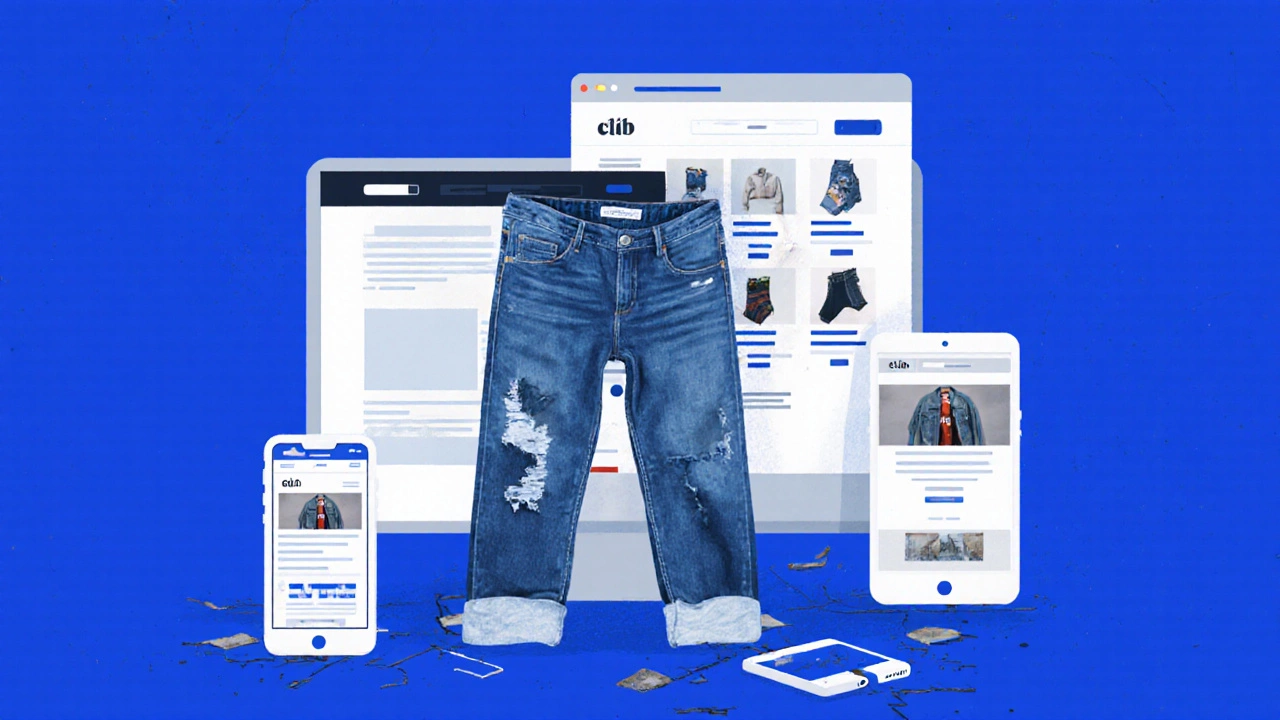
Responsive web design isn’t just making your site look smaller on a phone. It’s about building a site that adapts automatically-whether someone’s viewing it on a 27-inch monitor, a tablet, or a 5-inch smartphone. The layout shifts, images resize, buttons become tappable, and text reflows so nothing gets cut off or requires pinching and zooming.
Think of it like a pair of jeans that fits perfectly whether you’re sitting, standing, or running. Responsive design does the same for your website. It uses flexible grids, fluid images, and CSS media queries to adjust based on screen size. No separate mobile site. No redirects. Just one site that works everywhere.
The cost of ignoring it
Let’s say you run a small e-commerce store in Bangalore. You spent ₹50,000 on your website two years ago. It looks great on your laptop. But when your customers try to buy from their phones, the checkout button is tiny, the form fields are hard to tap, and the product images load slowly.
What happens? They leave. And they don’t come back. Google found that 53% of mobile users abandon a site that takes longer than 3 seconds to load. And if the layout is broken? That number jumps to 80%.
That’s not just lost sales. It’s lost trust. People assume if your website looks outdated on mobile, your business is outdated too. In 2025, that perception costs more than the cost of fixing it.
What responsive design actually delivers
- Higher conversion rates: Sites with responsive design see up to 30% more conversions on mobile, according to a 2024 Adobe study.
- Better SEO: Google uses mobile-first indexing. If your site isn’t responsive, it won’t rank well-even if it’s perfect on desktop.
- Lower maintenance: One codebase. One update. No need to manage separate mobile and desktop versions.
- Improved user experience: People don’t want to scroll sideways, zoom in on buttons, or hunt for menus. Responsive design removes friction.
- Future-proofing: New devices keep coming. Foldables, wearables, smart TVs-responsive design handles them without redesigning everything.
Real-world examples that work
Take Flipkart. In 2015, they rebuilt their site to be fully responsive. Within 18 months, mobile sales jumped from 25% to 68%. They didn’t just make it look better-they made it faster, simpler, and easier to buy on a phone.
Or consider Zomato. Their mobile site lets you search restaurants, read reviews, and order food-all without switching apps. That’s responsive design doing the heavy lifting. No native app needed. Just a website that behaves like one.
Even local businesses in Mysore or Coimbatore are seeing results. A bakery in Coimbatore redesigned their site to be responsive. Orders via mobile went up 47% in three months. Their phone calls dropped because people could just click "Order Now".
Is it expensive to implement?
Some agencies still charge ₹2-5 lakhs to "make your site mobile-friendly." That’s outdated thinking. If you’re starting fresh, responsive design is the standard. It’s not an add-on-it’s the baseline.
If you already have a site? Fixing it doesn’t mean rebuilding from scratch. Most older sites can be updated with CSS tweaks, image optimization, and layout adjustments. A skilled developer can make a non-responsive site responsive in 2-4 weeks for under ₹80,000.
Compare that to the cost of losing customers. If you lose 10 sales a day at ₹500 each, that’s ₹1.5 lakhs a month. Paying ₹80,000 to fix your site? That’s a return in less than two months.
What happens if you don’t do it?
Google doesn’t just penalize slow sites. It penalizes poorly structured ones. If your site isn’t responsive, it won’t appear in the top results on mobile searches. And since most searches happen on phones, you’re invisible to most people.
Also, competitors are already doing it. If your competitor’s site works perfectly on a phone and yours doesn’t, guess which one people choose? It’s not about being fancy. It’s about being functional.
And don’t think "my customers are all on desktop." That’s a myth. Even in tier-2 Indian cities, mobile usage dominates. A 2025 survey by the Internet and Mobile Association of India showed 92% of internet users access the web primarily through smartphones.

How to check if your site is responsive
- Open your website on your phone. Can you tap the main menu without zooming?
- Can you fill out a contact form without pinching and scrolling?
- Do images stretch, crop, or disappear on small screens?
- Does the site load in under 2 seconds on 3G?
- Use Google’s Mobile-Friendly Test tool (free). It tells you exactly what’s broken.
If you answered "no" to any of these, your site isn’t truly responsive. It’s just scaled down.
What to look for in a developer
Not all web developers know how to build responsive sites properly. Ask these questions:
- Do you use a mobile-first approach? (Answer should be yes.)
- Will you test on real devices, not just browser emulators?
- Can you show me examples of sites you’ve made responsive?
- Do you optimize images for different screen sizes?
A good developer won’t just resize things. They’ll restructure content for mobile behavior-shorter text, bigger buttons, simplified navigation.
The bottom line
Responsive web design isn’t a luxury. It’s the minimum requirement to stay relevant in 2025. If your website doesn’t work on a phone, you’re not just losing sales-you’re losing credibility, visibility, and trust.
The cost of fixing it is small. The cost of ignoring it? That keeps growing every day.
Is responsive web design the same as a mobile app?
No. A mobile app is a separate program you download from the App Store or Google Play. Responsive web design makes your website work like an app-on any device-without requiring users to install anything. It’s faster to update, cheaper to maintain, and accessible instantly through a browser.
Does responsive design slow down my website?
Not if done right. Poorly built responsive sites can load slowly if they load huge desktop images on phones. But a good developer uses techniques like lazy loading, image optimization, and conditional resource loading. The result? Faster load times on mobile than a non-responsive site.
Can I make my WordPress site responsive?
Yes. Most modern WordPress themes are responsive by default. If you’re using an old theme from 2018 or earlier, you may need to switch. Plugins like Elementor or Divi make it easy to rebuild your site with responsive layouts without coding. Just check your theme’s demo on a phone before buying.
Do I need to redesign my whole site to make it responsive?
Not always. If your site uses modern HTML and CSS, you might only need to adjust the stylesheet. But if your site was built with tables for layout or fixed pixel widths, a full rebuild is often faster than patching it. The key is testing-see what breaks on mobile, then fix the root cause.
Is responsive design still important with apps dominating?
More than ever. Most people don’t download apps unless they’re frequent users. For casual shoppers, service seekers, or first-time visitors, a website is the first-and often only-touchpoint. A responsive site gives you the reach of an app without the friction of installation. It’s the most efficient way to serve mobile users.
If you’re still wondering whether responsive web design is worth it, ask yourself this: Would you open a physical store with broken doors, dim lights, and no signage? Of course not. Your website is your digital storefront. Make sure it welcomes everyone-no matter what device they’re using.