
Website Responsiveness Impact Calculator
Enter your current website statistics to estimate how much you might be losing by having a non-responsive site.
Current Metrics
You spent weeks designing your site. You picked the perfect fonts, tweaked the colors, and wrote compelling copy. Then you opened it on your phone during a commute, and everything broke. Text was tiny, buttons were impossible to tap, and images stretched weirdly. That sinking feeling? That’s the reality of ignoring responsive web design. It isn't just an aesthetic choice anymore; it's a survival mechanism for your digital presence.
Most people assume a non-responsive site just looks bad. But the damage goes deeper. It hits your revenue, your search rankings, and your brand credibility. Let’s break down exactly what happens when your site fails the mobile test, and why fixing it is urgent in 2026.
The Mobile-First Reality Check
Here is a hard truth: if your site isn’t responsive, you are likely losing more than half your potential traffic before they even read a word. According to recent global data, over 60% of all web traffic comes from mobile devices. In India, where many users rely on smartphones as their primary internet gateway, this number can be even higher depending on your niche.
Mobile-first indexing means Google primarily uses the mobile version of your content for ranking and indexing. If your desktop site is beautiful but your mobile view is a mess, Google sees that mess. It doesn’t matter how good your desktop layout is if the bot crawling your site encounters broken elements or hidden content on a smartphone viewport.
Think about your own habits. When you visit a site on your phone and have to pinch-zoom to read text, what do you do? Most people leave. They don’t wait for the page to load better. They hit the back button and go to a competitor who respects their time and screen size.
Bounce Rates Skyrocket
A high bounce rate is one of the most immediate symptoms of a non-responsive site. This metric measures the percentage of visitors who leave after viewing only one page. For a poorly optimized mobile site, this number often exceeds 70% or 80%.
Why does this happen? Friction. Every second a user spends struggling to navigate a non-adaptive layout increases their frustration. Common issues include:
- Horizontal scrolling required to see full-width images.
- Buttons placed too close together, leading to accidental clicks.
- Text sizes that are unreadable without zooming.
- Forms with fields that don’t trigger the correct keyboard type (e.g., email field not showing '@' key).
When users bounce quickly, search engines interpret this as a signal that your content wasn’t relevant or useful. Even if your content is excellent, the poor delivery method kills its value. You’re essentially shouting your message through a megaphone that’s pointed at the ground.
SEO Rankings Take a Hit
Search engine optimization isn’t just about keywords anymore. User Experience (UX) signals play a massive role in how Google ranks pages. Since the rollout of Core Web Vitals, metrics like Largest Contentful Paint (LCP) and Cumulative Layout Shift (CLS) have become critical.
A non-responsive site often suffers from poor CLS. Elements jump around as the page loads because the CSS wasn’t designed to handle different viewport widths gracefully. This instability annoys users and lowers your Core Web Vitals score. A low score directly correlates with lower visibility in search results.
| Metric | Responsive Site Benchmark | Non-Responsive Site Impact |
|---|---|---|
| Bounce Rate | 40-50% | Increases by 20-30% |
| Average Session Duration | 2-3 minutes | Drops below 1 minute |
| Conversion Rate | Industry Average | Decreases by up to 50% |
| Core Web Vitals Score | Passing (Green) | Failing (Red/Orange) |
Notice the trend? Every negative UX factor compounds into another. Higher bounce rates lead to lower dwell time, which leads to poorer quality scores, which leads to worse rankings. It’s a downward spiral that gets harder to reverse the longer you ignore it.

Brand Credibility Erosion
People judge books by their covers, and businesses by their websites. If your site looks outdated or broken on a mobile device, users subconsciously associate those flaws with your business operations. They might think, "If they can’t keep their website updated, how well will they handle my order?"
This perception gap is dangerous. Trust is fragile. A sleek, responsive interface suggests professionalism and attention to detail. A clunky, fixed-width layout suggests neglect. In competitive markets, especially in tech and retail, first impressions are formed in milliseconds. You don’t get a second chance to make a good first impression.
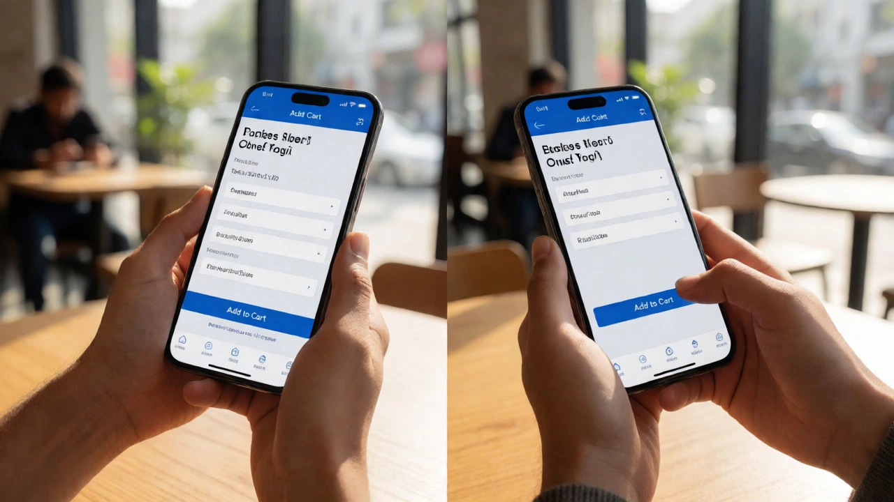
Consider e-commerce. If a customer tries to buy a product but can’t easily add it to the cart because the button is off-screen on their iPhone, they won’t blame their phone. They’ll blame your store. And they’ll take their credit card elsewhere.
Increased Maintenance Costs
Many businesses try to solve the mobile problem by creating a separate "m-dot" site (like m.yourbrand.com). While this was a popular solution in the early 2010s, it creates a maintenance nightmare today.
With two separate sites, you have to update content twice. You need to manage two sets of URLs, which confuses search engines unless you implement complex canonical tags correctly. You also double your testing workload. Every new feature needs to be built and tested for both desktop and mobile versions separately.
Responsive design uses a single codebase with fluid grids and flexible images. You write the code once, and it adapts to any screen size. This saves development time and reduces bugs. Ignoring responsiveness forces you to pay more in long-term maintenance for a worse user experience.
Accessibility Issues
Responsiveness overlaps heavily with accessibility. A site that scales properly helps users with visual impairments who use screen magnifiers or browser zoom features. If your site has fixed pixel widths, zooming in often breaks the layout, causing horizontal scrollbars to appear everywhere. This makes navigation difficult for elderly users or those with motor control issues.
By adopting responsive principles, you improve accessibility for everyone. Larger touch targets, readable font sizes, and logical tab orders benefit all users, not just those on small screens. It’s an ethical obligation and a smart business move.
How to Fix It: Quick Wins
If you suspect your site isn’t responsive, don’t panic. You can start with simple checks:
- The Resize Test: Open your site on a desktop browser. Grab the edge of the window and drag it narrower. Does the layout adapt smoothly, or do elements overlap and disappear?
- Check Viewport Meta Tag: Ensure your HTML head includes
<meta name="viewport" content="width=device-width, initial-scale=1.0">. Without this, mobile browsers default to desktop rendering. - Test Touch Targets: Use a physical smartphone to click every link and button. Are they easy to hit with a thumb?
- Run Lighthouse Audit: Use Chrome DevTools’ Lighthouse tool. It gives you a specific score for mobile usability and highlights specific CSS issues.
For many older sites, a complete redesign might be necessary. But sometimes, updating your CSS media queries and switching to a flexible grid system can solve 80% of the problems without a total rebuild.
Frequently Asked Questions
Is responsive design still relevant in 2026?
Absolutely. With foldable phones, tablets, and varying desktop monitor resolutions, having a single codebase that adapts to any container width is more important than ever. It simplifies development and ensures consistency across all devices.
Does a non-responsive site hurt my Google Ads Quality Score?
Yes. Google evaluates landing page experience, which includes mobile-friendliness. A poor mobile experience can lower your Quality Score, increasing your cost-per-click (CPC) and reducing ad effectiveness.
Can I just redirect mobile users to a separate app?
Not always. Many users prefer browsing via mobile web rather than downloading an app. Relying solely on an app excludes users who won’t install it. A responsive web presence captures everyone.
How much does it cost to fix a non-responsive website?
Costs vary widely based on complexity. Simple template updates might cost a few hundred dollars, while custom legacy sites may require thousands for a full responsive overhaul. However, the ROI usually outweighs the cost due to increased conversions.
What is the difference between adaptive and responsive design?
Responsive design uses fluid grids and percentages to scale continuously. Adaptive design uses predefined static layouts for specific breakpoints (e.g., mobile, tablet, desktop). Responsive is generally preferred for its flexibility and smoother transitions.