UI/UX Design Roadmap & Tool Selector
Select a design tool below to see its suitability for beginners, industry adoption, and recommended learning timeline based on current market trends.
Figma
RecommendedSketch
Mac OnlyAdobe XD
NicheFramer
AdvancedTool Details
Best For:
-
Learning Curve:
Industry Adoption:
-
Recommended Learning Timeline
General Beginner Roadmap
Phase 1: Fundamentals (Weeks 1-4)
Master hierarchy, consistency, accessibility (WCAG), and feedback loops. Perform app teardowns.
Phase 2: Tool Mastery (Months 2-3)
Learn interface, components, auto-layout, and basic prototyping. Focus on one tool deeply.
Phase 3: User Research (Month 4)
Conduct competitive analysis, user interviews, and create personas. Stop guessing, start listening.
Phase 4: Portfolio Building (Months 5-6)
Create 3 deep case studies. Structure them as Problem -> Research -> Ideation -> Design -> Validation.
Phase 5: Job Readiness (Months 7+)
Network, attend meetups, refine resume with tools/soft skills, and apply for junior roles.
You stare at a blank canvas in Figma or Sketch, cursor blinking, and wonder where the hell you’re supposed to start. You’ve watched a dozen YouTube videos on "best practices," downloaded every free icon pack available, and still feel like an imposter when someone asks why you chose that specific shade of blue. It’s not magic, and it’s definitely not just about making things look pretty. Learning UI/UX design is a structured skill set that blends psychology, logic, and visual communication. If you want to go from zero to job-ready without wasting years on theory that doesn’t apply to real work, you need a clear path. Here is how you actually learn it, step by step.
The Core Difference Between UI and UX
Before you open any tool, get your definitions straight. Mixing them up is the fastest way to confuse yourself and potential employers. User Experience (UX) is about how something works and feels. It’s the architecture of the interaction. Did the user find what they needed? Was the checkout process frustrating or smooth? Did the app save them time? Think of UX as the blueprint of a house-the placement of doors, the flow between rooms, the lighting strategy.
User Interface (UI) is about how it looks. It’s the paint, the furniture, the typography, and the color palette. It ensures the house isn’t just functional but also inviting and easy to navigate visually. You cannot have good UI without good UX, but you can have terrible UI with great UX (think of early Craigslist). In modern product teams, these roles often overlap, especially for juniors. But understanding the distinction helps you know which skills to prioritize first. Start with UX thinking, then layer UI execution on top.
Mastering the Fundamentals Before Tools
Tools change. Figma might dominate today, but something else could take over in five years. Principles don’t. If you skip the fundamentals, you’ll end up designing screens that look nice but fail to solve problems. Spend the first few weeks absorbing core concepts rather than learning shortcuts.
- Hierarchy: How do you guide the eye? Larger fonts, bold weights, and strategic whitespace tell users what matters most. If everything is shouting, nothing is heard.
- Consistency: Users hate surprises. Buttons should look like buttons everywhere. Navigation patterns should repeat. This reduces cognitive load.
- Accessibility: Contrast ratios matter. The Web Content Accessibility Guidelines (WCAG) require a minimum contrast ratio of 4.5:1 for normal text. Ignoring this excludes millions of users and hurts SEO.
- Feedback: Every action needs a reaction. When a user clicks a button, does it depress? Does a loader appear? Silent interfaces make users anxious.
A great way to internalize these is through teardowns. Pick an app you use daily, like WhatsApp or Instagram. Screenshot three flows-sign-up, posting content, settings-and write down exactly what works and what annoys you. Why did they place the camera icon there? Why is the delete button red? This habit trains your brain to see design decisions, not just pixels.
Learning the Right Tools (And Only the Right Ones)
Don’t try to learn Photoshop, Illustrator, Sketch, Figma, Adobe XD, and Protopie all at once. You’ll burn out. For 2026, the industry standard is overwhelmingly Figma. It’s browser-based, collaborative, and has a massive community of plugins and templates. It allows multiple designers to edit the same file in real-time, which mirrors how actual agencies work.
Here’s a realistic timeline for tool mastery:
- Weeks 1-2: Learn the interface. Frames, groups, components, and auto-layout. Auto-layout is non-negotiable; it’s how you build responsive designs efficiently.
- Weeks 3-4: Build simple components. Create a button system with states (default, hover, pressed, disabled). Use variants to manage different types of buttons.
- Month 2: Prototyping. Link screens together. Add interactions like "Smart Animate" to show how a menu slides in. Test it on your phone.
Skip advanced features like variables and conditional logic until you’re comfortable with the basics. Depth beats breadth here.
| Tool | Best For | Learning Curve | Industry Adoption |
|---|---|---|---|
| Figma | Collaborative web/app design | Moderate | Very High |
| Sketch | Mac-only native apps | Steep | Declining |
| Adobe XD | Adobe ecosystem users | Low | Niche |
| Framer | High-fidelity interactive sites | High | Growing |

Conducting Real User Research
This is where most self-taught designers fail. They guess. They assume their taste matches the user’s needs. It rarely does. User Research is the process of gathering data to inform design decisions. You don’t need a budget of $10,000 to do it. You need curiosity and five people.
Start with Competitive Analysis. Look at three competitors. What features do they all have? Where do they differ? Then move to User Interviews. Ask friends or colleagues who fit your target audience. Don’t ask leading questions like "Do you like this layout?" Instead, ask "Walk me through how you usually book a doctor's appointment." Listen to their pain points. Do they complain about too many steps? Confusing forms?
Create Personas. These are fictional characters representing your user segments. Give them names, goals, and frustrations. "Sarah, 28, wants to order groceries quickly during her lunch break but hates complicated filters." Now, when you design, you ask: "Would Sarah understand this button?" This keeps you grounded.
Building Your First Portfolio Project
Your portfolio isn’t a gallery of pretty pictures. It’s a case study collection. Hiring managers want to see your thought process, not just the final screen. Pick one problem to solve. It could be redesigning a local library website or creating an app for tracking plant care.
Structure each project like this:
- The Problem: Clearly state what issue you are solving. "Users struggle to find nearby vegan restaurants."
- Research: Show screenshots of your interviews, surveys, or competitive analysis. Prove you didn’t just guess.
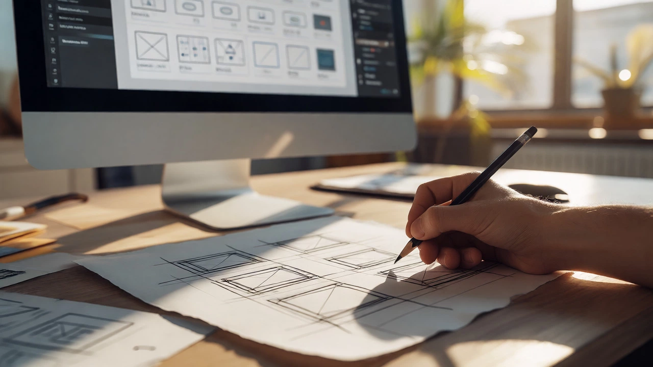
- Ideation: Include photos of your sketches and wireframes. Messy paper sketches are better than polished digital ones because they show exploration.
- Design: Show the high-fidelity UI. Explain your choices. "I used green because it associates with freshness and health."
- Validation: Did you test it? Even if it was just showing it to two friends, mention what they found confusing and how you fixed it.
Quality over quantity. Three deep case studies beat ten shallow mockups. Make sure your portfolio site itself is usable. If the navigation on your portfolio is broken, you lose credibility instantly.

Getting Feedback and Iterating
Design is iterative. You will never get it right the first time. Share your work early and often. Post your drafts on communities like Dribbble, Behance, or specialized Discord servers for designers. Be thick-skinned. Criticism isn’t personal; it’s data.
When you receive feedback, categorize it. Is it about usability ("I couldn't find the login button") or aesthetics ("I don't like purple")? Usability feedback is critical. Aesthetic feedback is subjective. Trust the former, consider the latter. Iterate based on the data. Change the button size. Move the login link. Test again. This loop-design, test, refine-is the heart of UX.
Next Steps for Your Career
Once you have three solid case studies, start applying for junior roles or internships. Tailor your resume to highlight tools (Figma, Miro) and soft skills (communication, empathy). Network locally. In cities like Bangalore, there are numerous meetups for product designers. Attend them. Bring business cards or a QR code to your portfolio. Talk to people. Many jobs are filled before they’re posted online.
Keep learning. Read articles from NN/g (Nielsen Norman Group), follow designers on LinkedIn, and stay updated on trends like AI-assisted design tools. But remember, trends fade. Solid fundamentals last. Focus on solving human problems, and the rest will follow.
Do I need a degree in design to become a UX/UI designer?
No, you do not. While degrees in HCI, Psychology, or Graphic Design help, many successful designers come from coding, marketing, or unrelated fields. Your portfolio and ability to demonstrate problem-solving skills matter far more than your diploma. Self-taught paths are common and respected if backed by strong case studies.
How long does it take to learn UI/UX design?
With consistent effort (15-20 hours a week), you can reach a junior-level competency in 6 to 9 months. This includes learning tools, understanding principles, conducting basic research, and building a portfolio with 3-4 case studies. Mastery takes years, but employability comes much sooner.
Is coding necessary for UX designers?
It is not strictly necessary for pure UX roles, but knowing HTML/CSS basics is a huge advantage. It helps you communicate better with developers and understand technical constraints. You don’t need to write production code, but understanding how a flexbox works prevents you from designing impossible layouts.
What is the difference between wireframing and prototyping?
Wireframing is low-fidelity and focuses on structure and layout without colors or images. It’s like a blueprint. Prototyping is higher fidelity and interactive, simulating the actual user experience. Wireframes are for testing ideas quickly; prototypes are for testing usability and flow.
Can I learn UI/UX while working full-time?
Yes, many people do. Dedicate evenings and weekends to focused practice. Consistency is key. Two hours daily is better than ten hours once a week. Use weekends for deeper projects like case studies, and weekdays for smaller tasks like tutorials or teardowns.
