Responsive Typography Calculator
Use this tool to calculate how font sizes scale using CSS clamp(). Enter your minimum, ideal, and maximum values, and see how the text adapts across different screen sizes.
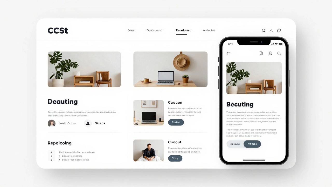
Preview
Generated CSS Code
Most people think making a website responsive means writing dozens of CSS rules for every screen size. That’s not true anymore-and it hasn’t been for years. You don’t need to manually tweak every element for phones, tablets, and desktops. There are real, working ways to make a website responsive automatically, without coding every breakpoint by hand.
Responsive design doesn’t mean manual coding
Back in 2015, if you wanted a site to work on mobile, you wrote media queries for 320px, 768px, 1024px, and so on. You adjusted margins, hid elements, resized fonts. It was tedious. Today, you can skip most of that.
The secret? Modern CSS gives you tools that adapt fluidly. You don’t have to define every screen size. You just need to set boundaries and let the browser handle the rest.
Use CSS container queries instead of viewport queries
Container queries are the biggest leap in responsive design since flexbox. Unlike media queries that respond to the browser window, container queries respond to the size of the element’s parent container.
Example: You have a card component that should show three columns on wide screens and one column on narrow ones. With container queries, you write:
.card-container {
  container-type: inline-size;
}

@container (min-width: 300px) {
  .card {
    width: 100%;
  }
}

@container (min-width: 700px) {
  .card {
    width: calc(100% / 3);
  }
}
This means your card responds to the space it’s in-not the whole page. You can drop that card into a sidebar, a modal, or a grid, and it adjusts automatically. No need to write separate rules for every page layout.
Fluid typography with clamp()
Font sizes that scale smoothly across devices? That’s clamp(). It lets you set a minimum, ideal, and maximum font size in one line.
h1 {
  font-size: clamp(1.5rem, 4vw, 3rem);
}
This means:
- On very small screens: font size never drops below 1.5rem
- On medium screens: font size scales with viewport width (4vw)
- On very large screens: font size caps at 3rem
No media queries needed. No JavaScript. Just one line that works everywhere.
Flexible layouts with CSS Grid and Flexbox
Grid and Flexbox are the foundation of modern responsive design. They don’t need breakpoints to work well.
For example, this grid will auto-fit columns based on available space:
.grid {
  display: grid;
  grid-template-columns: repeat(auto-fit, minmax(250px, 1fr));
}
That’s it. No media queries. No numbers like 768px. The browser calculates how many 250px-wide columns fit in the container-and fills the rest with equal space. On a phone? One column. On a tablet? Two. On a desktop? Four or five.
Same goes for Flexbox:
.flex-container {
  display: flex;
  flex-wrap: wrap;
}

.flex-item {
  flex: 1 1 200px;
}
Each item will grow, shrink, and wrap naturally. The browser does the math. You just define the minimum width and let it flow.

Use relative units, not pixels
Pixels are fixed. They don’t scale. If you set a button to width: 200px, it’ll look tiny on a 4K monitor and huge on a phone.
Switch to relative units:
rem- relative to root font size (best for spacing and typography)em- relative to parent font size (good for nested elements)vw/vh- relative to viewport width/height (use sparingly)%- percentage of parent container (great for layouts)
Example: Instead of padding: 20px, use padding: 1.5rem. If the root font size changes (say, due to user preferences), your padding scales with it.
Automate with CSS frameworks (but choose wisely)
Frameworks like Bootstrap or Tailwind CSS promise “responsive by default.” And they do-but only if you use them correctly.
Bootstrap’s grid system uses media queries under the hood. It’s fine for quick prototypes, but you’re still locked into their breakpoints. If you only need basic responsiveness, you don’t need the whole framework.
Tailwind’s utility-first approach lets you write responsive classes like md:text-lg or lg:flex. It’s more flexible, but you’re still writing breakpoints manually.
Best approach? Use vanilla CSS with clamp(), auto-fit, and container queries. Only reach for a framework if you’re building a complex admin panel or enterprise app with strict design systems.
Test with real devices, not just browser dev tools
DevTools is great-but it’s not perfect. A 375px wide screen in Chrome doesn’t behave exactly like an iPhone 14. Different browsers render fonts, scrolling, and touch interactions differently.
Use free tools like BrowserStack or LambdaTest to test on real devices. Or borrow a friend’s phone. Look at your site on a tablet during lunch. See how the text wraps. Check if buttons are easy to tap.
Responsive design isn’t about code. It’s about experience.

What doesn’t work
There are a lot of tools and plugins that claim to “automatically make your site responsive.” Most are gimmicks.
- JavaScript libraries that resize everything on load? They cause layout shifts and slow down your site.
- Plugins that add iframes to “embed” your site on mobile? They break navigation and hurt SEO.
- Auto-scaling widgets that zoom the whole page? They make text unreadable and users hate them.
True responsiveness comes from CSS structure-not JavaScript hacks.
Real-world example: A blog post
Take a simple blog layout:
- Header with logo and menu
- Main content with image and text
- Side sidebar with related posts
With modern CSS, you can make this fully responsive in under 30 lines of CSS:
body {
  margin: 0;
  font-size: clamp(0.9rem, 1.5vw, 1rem);
}

.container {
  display: grid;
  grid-template-columns: repeat(auto-fit, minmax(300px, 1fr));
  gap: 2rem;
  padding: 2rem;
}

.sidebar {
  grid-column: span 1;
}

.content {
  grid-column: span 2;
}

@media (max-width: 600px) {
  .container {
    grid-template-columns: 1fr;
  }

  .content, .sidebar {
    grid-column: span 1;
  }
}
Wait-that last part has a media query. Why?
Because sometimes you need one. Not for every element. Just to fix edge cases. The rest? Handled by auto-fit and clamp(). You’re not writing for 10 screen sizes. You’re writing for one flexible system.
Bottom line: Yes, you can automate responsiveness
You don’t need to write separate styles for every device. You don’t need to hire a specialist. You don’t need to spend weeks tweaking pixels.
Use fluid layouts with CSS Grid and Flexbox. Use clamp() for typography. Use container queries for component-level responsiveness. Use relative units everywhere. Avoid JavaScript hacks.
That’s it. That’s the entire method. Modern browsers handle the heavy lifting. Your job is to set the rules-not the exact sizes.
If you’re starting a new site today, skip the old ways. Build with these tools from day one. Your future self-and your users-will thank you.
Can I make my existing website responsive without rebuilding it?
Yes, but it depends. If your site uses fixed widths, pixels, and tables for layout, you’ll need to rewrite the CSS. Start by replacing pixel values with rem or %, then switch to Flexbox or Grid. You can’t just slap on a plugin and call it done. Real responsiveness requires structural changes, not quick fixes.
Do I still need media queries at all?
Not for everything. Use container queries and fluid units first. Media queries are still useful for major layout shifts-like changing a sidebar from side to bottom. But you shouldn’t need more than 2-3 media queries in a modern site. Most responsive behavior should come from CSS layout systems, not breakpoints.
Is responsive design the same as mobile-first design?
No. Mobile-first means designing for small screens first, then adding features for larger screens. Responsive design means the layout adapts to any screen size. You can do responsive design without being mobile-first-like starting with desktop and scaling down. But mobile-first is easier and leads to cleaner code. Most modern developers start small.
What’s the fastest way to test if my site is responsive?
Open your site in Chrome, press F12, then click the device toggle icon. Resize the window slowly. Watch how text wraps, images resize, and buttons stay tappable. If anything breaks-like text overlapping or buttons becoming too small-you need to fix it. Also, open the site on your phone. If you have to pinch and zoom to read text, it’s not truly responsive.
Will using CSS Grid slow down my website?
No. CSS Grid is optimized by browsers and performs better than older layout methods like floats or tables. In fact, it often reduces the need for JavaScript and complex HTML structures, which speeds up your site. The only performance hit comes from poorly written media queries or excessive JavaScript. Grid itself is fast.
Can I use these techniques with WordPress or Shopify?
Absolutely. WordPress themes and Shopify stores use CSS too. You can override default styles by adding custom CSS in the theme editor. Replace fixed-width containers with max-width: 100% and use grid-template-columns: repeat(auto-fit, minmax(250px, 1fr)) for product grids. Most themes are built on outdated methods-but you can modernize them without switching platforms.